處理使用者輸入
既然您知道如何在 Flutter 應用程式中管理狀態,您如何讓使用者與您的應用程式互動並變更其狀態?
使用者輸入處理簡介
#作為一個多平台 UI 框架,使用者與 Flutter 應用程式互動的方式有很多種。本節中的資源將向您介紹一些常用的 Widget,用於在您的應用程式中啟用使用者互動。
接下來,我們將介紹一些 Material Widget,這些 Widget 支援在您的 Flutter 應用程式中處理使用者輸入的常見使用案例。
按鈕
#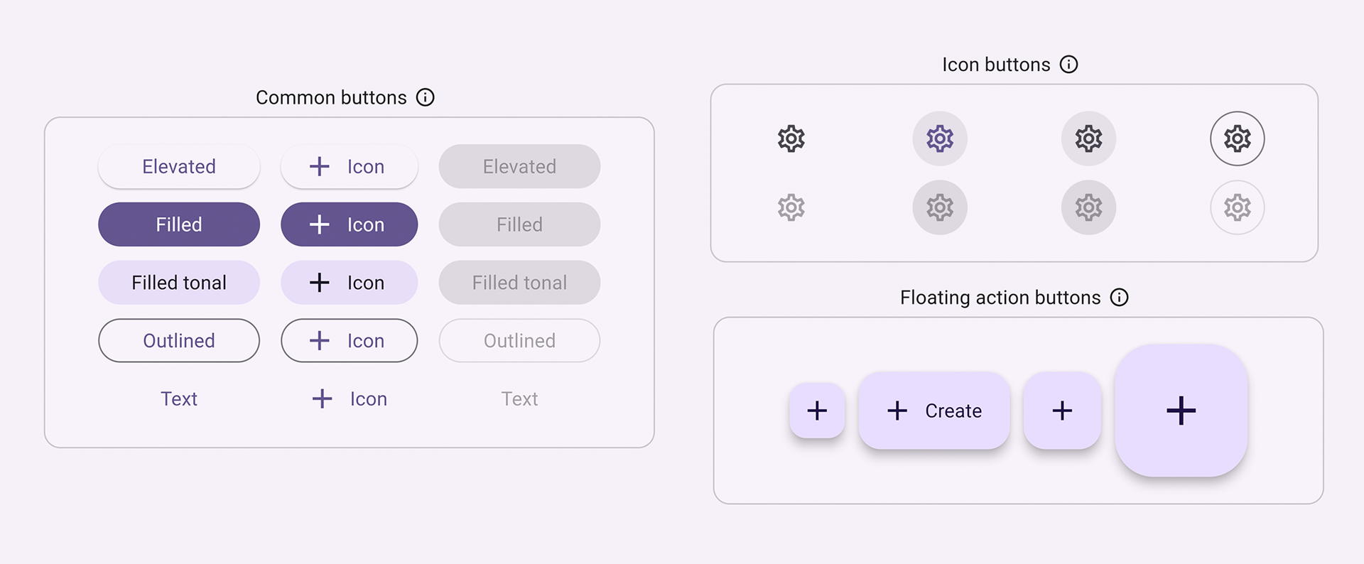
按鈕允許使用者透過點擊或輕觸來啟動 UI 中的動作。Material 程式庫提供了多種功能相似但樣式不同的按鈕類型,適用於各種使用案例,包括
ElevatedButton:具有一些深度的按鈕。使用凸起的按鈕為其他大部分為平面的版面配置增加維度。FilledButton:填滿的按鈕,應用於重要、完成流程的最終動作,例如儲存、立即加入或確認。Tonal Button:介於FilledButton和OutlinedButton之間的按鈕。它們適用於較低優先級的按鈕需要比輪廓更多的強調的情況,例如下一步。OutlinedButton:具有文字和可見邊框的按鈕。這些按鈕包含重要但不是應用程式中主要動作的動作。TextButton:可點擊的文字,沒有邊框。由於文字按鈕沒有可見邊框,因此它們必須依賴其相對於其他內容的位置來取得上下文。IconButton:具有圖示的按鈕。FloatingActionButton:懸浮在內容上的圖示按鈕,用於宣傳主要動作。
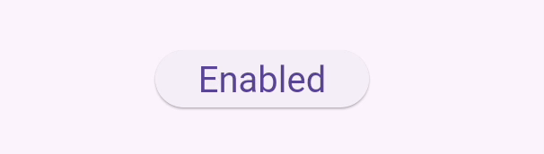
建構按鈕通常有 3 個主要方面:樣式、回呼及其子項,如下列 ElevatedButton 範例程式碼所示
按鈕的回呼函式
onPressed決定了點擊按鈕時會發生什麼事,因此,此函式是您更新應用程式狀態的地方。如果回呼是null,則按鈕會停用,而且當使用者按下按鈕時不會發生任何事情。按鈕的
child(顯示在按鈕的內容區域中)通常是文字或圖示,用於指示按鈕的用途。最後,按鈕的
style會控制其外觀:顏色、邊框等等。
int count = 0;

@override
Widget build(BuildContext context) {
  return ElevatedButton(
    style: ElevatedButton.styleFrom(
      textStyle: const TextStyle(fontSize: 20),
    ),
    onPressed: () {
      setState(() {
        count += 1;
      });
    },
    child: const Text('Enabled'),
  );
}
檢查點:完成此教學課程,它會教您如何建構「最愛」按鈕:將互動性新增至您的 Flutter 應用程式
API 文件:ElevatedButton • FilledButton • OutlinedButton • TextButton • IconButton • FloatingActionButton
文字
#有幾個 Widget 支援文字輸入。
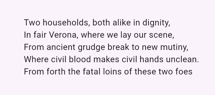
SelectableText
#Flutter 的 Text Widget 會在畫面上顯示文字,但不允許使用者反白或複製文字。SelectableText 會顯示使用者可選取的文字字串。
@override
Widget build(BuildContext context) {
  return const SelectableText('''
Two households, both alike in dignity,
In fair Verona, where we lay our scene,
From ancient grudge break to new mutiny,
Where civil blood makes civil hands unclean.
From forth the fatal loins of these two foes''');
}
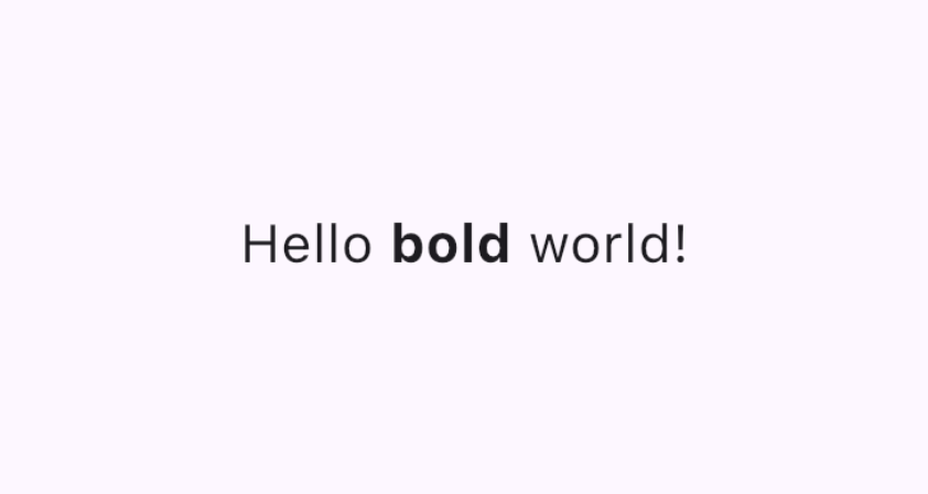
RichText
#RichText 可讓您在應用程式中顯示豐富文字字串。與 RichText 類似的 TextSpan 可讓您顯示具有不同文字樣式的文字部分。它不是用於處理使用者輸入,而是如果您允許使用者編輯和設定文字格式時很有用。
@override
Widget build(BuildContext context) {
  return RichText(
    text: TextSpan(
      text: 'Hello ',
      style: DefaultTextStyle.of(context).style,
      children: const <TextSpan>[
        TextSpan(text: 'bold', style: TextStyle(fontWeight: FontWeight.bold)),
        TextSpan(text: ' world!'),
      ],
    ),
  );
}
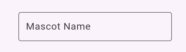
TextField
#TextField 可讓使用者使用硬體或螢幕鍵盤在文字方塊中輸入文字。
TextField 有許多不同的屬性和配置。以下是一些重點
InputDecoration決定文字欄位的外觀,例如顏色和邊框。controller:TextEditingController控制正在編輯的文字。您為什麼可能需要控制器?預設情況下,您的應用程式使用者可以在文字欄位中輸入文字,但如果您想要以程式方式控制TextField並清除其值,例如,您將需要TextEditingController。onChanged:當使用者變更文字欄位的值時(例如插入或移除文字時),會觸發此回呼函式。onSubmitted:當使用者表示他們已完成編輯欄位中的文字時,會觸發此回呼;例如,當文字欄位處於焦點時,點擊「輸入」鍵。
此類別支援其他可配置的屬性,例如將每個字母變成輸入時的 readOnly 圓形的 obscureText,以及阻止使用者變更文字的 readOnly。
final TextEditingController _controller = TextEditingController();

@override
Widget build(BuildContext context) {
  return TextField(
    controller: _controller,
    decoration: const InputDecoration(
      border: OutlineInputBorder(),
      labelText: 'Mascot Name',
    ),
  );
}
檢查點:完成這個 4 部分的食譜系列,逐步引導您如何建立文字欄位、擷取其值並更新您的應用程式狀態
表單
#Form 是一個可選的容器,用於將多個表單欄位 Widget 分組在一起,例如 TextField。
每個個別的表單欄位都應該包裝在以 Form Widget 作為共同祖先的 FormField Widget 中。現有的便利 Widget 會為您將表單欄位 Widget 預先包裝在 FormField 中。例如,TextField 的 Form Widget 版本是 TextFormField。
使用 Form 可讓您存取 FormState,這可讓您儲存、重設和驗證繼承自此 Form 的每個 FormField。您也可以提供 GlobalKey 以識別特定的表單,如下列程式碼所示
final GlobalKey<FormState> _formKey = GlobalKey<FormState>();

@override
Widget build(BuildContext context) {
  return Form(
    key: _formKey,
    child: Column(
      crossAxisAlignment: CrossAxisAlignment.start,
      children: <Widget>[
        TextFormField(
          decoration: const InputDecoration(
            hintText: 'Enter your email',
          ),
          validator: (String? value) {
            if (value == null || value.isEmpty) {
              return 'Please enter some text';
            }
            return null;
          },
        ),
        Padding(
          padding: const EdgeInsets.symmetric(vertical: 16.0),
          child: ElevatedButton(
            onPressed: () {
              // Validate returns true if the form is valid, or false otherwise.
              if (_formKey.currentState!.validate()) {
                // Process data.
              }
            },
            child: const Text('Submit'),
          ),
        ),
      ],
    ),
  );
}檢查點:完成此教學課程以學習如何使用驗證建構表單。
範例:表單應用程式
程式碼:表單應用程式程式碼
API 文件:TextField • RichText • SelectableText • Form
從選項群組中選擇值
#提供使用者從多個選項中進行選擇的方式。
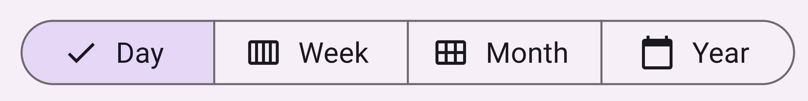
SegmentedButton
#SegmentedButton 可讓使用者從最少 2-5 個項目群組中進行選擇。
資料類型 <T> 可以是內建類型,例如 int、String、bool 或列舉。SegmentedButton 有幾個相關的屬性
segments,ButtonSegment的清單,其中每個都代表使用者可以選取的「區段」或選項。在視覺上,每個ButtonSegment都可以有圖示、文字標籤或兩者都有。multiSelectionEnabled指示是否允許使用者選取多個選項。此屬性預設為 false。selected識別目前選取的值。注意:selected的類型是Set<T>,因此如果您只允許使用者選取一個值,則該值必須以具有單一元素的Set提供。當使用者選取任何區段時,會觸發
onSelectionChanged回呼。它會提供選取區段的清單,以便您可以更新您的應用程式狀態。其他樣式參數可讓您修改按鈕的外觀。例如,
style採用ButtonStyle,提供設定selectedIcon的方法。
enum Calendar { day, week, month, year }

// StatefulWidget...
Calendar calendarView = Calendar.day;

@override
Widget build(BuildContext context) {
  return SegmentedButton<Calendar>(
    segments: const <ButtonSegment<Calendar>>[
      ButtonSegment<Calendar>(
          value: Calendar.day,
          label: Text('Day'),
          icon: Icon(Icons.calendar_view_day)),
      ButtonSegment<Calendar>(
          value: Calendar.week,
          label: Text('Week'),
          icon: Icon(Icons.calendar_view_week)),
      ButtonSegment<Calendar>(
          value: Calendar.month,
          label: Text('Month'),
          icon: Icon(Icons.calendar_view_month)),
      ButtonSegment<Calendar>(
          value: Calendar.year,
          label: Text('Year'),
          icon: Icon(Icons.calendar_today)),
    ],
    selected: <Calendar>{calendarView},
    onSelectionChanged: (Set<Calendar> newSelection) {
      setState(() {
        Suggested change
        // By default there is only a single segment that can be
        // selected at one time, so its value is always the first
        // By default, only a single segment can be
        // selected at one time, so its value is always the first
        calendarView = newSelection.first;
      });
    },
  );
}
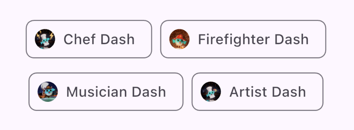
Chip
#Chip 是一種以精簡方式表示特定內容的屬性、文字、實體或動作的方法。存在用於特定使用案例的專門 Chip Widget
- InputChip 以精簡的形式表示複雜的資訊,例如實體(人員、地點或事物)或對話文字。
- ChoiceChip 允許從一組選項中進行單一選擇。Choice Chip 包含相關的描述性文字或類別。
- FilterChip 使用標籤或描述性文字來篩選內容。
- ActionChip 表示與主要內容相關的動作。
每個 Chip 小工具都必須要有 label。它可以選擇性地擁有一個 avatar(例如圖示或使用者的大頭貼)和一個 onDeleted 回呼函式,該函式會顯示一個刪除圖示,當觸發時,會刪除這個 Chip。Chip 小工具的外觀也可以透過設定一些可選的參數來自訂,例如 shape、color 和 iconTheme。
您通常會使用 Wrap 這個小工具,它會在多個水平或垂直的運行中顯示其子元件,以確保您的 Chip 可以換行,而不會在應用程式的邊緣被截斷。
@override
Widget build(BuildContext context) {
  return const SizedBox(
    width: 500,
    child: Wrap(
      alignment: WrapAlignment.center,
      spacing: 8,
      runSpacing: 4,
      children: [
        Chip(
          avatar: CircleAvatar(
              backgroundImage: AssetImage('assets/images/dash_chef.png')),
          label: Text('Chef Dash'),
        ),
        Chip(
          avatar: CircleAvatar(
              backgroundImage:
                  AssetImage('assets/images/dash_firefighter.png')),
          label: Text('Firefighter Dash'),
        ),
        Chip(
          avatar: CircleAvatar(
              backgroundImage: AssetImage('assets/images/dash_musician.png')),
          label: Text('Musician Dash'),
        ),
        Chip(
          avatar: CircleAvatar(
              backgroundImage: AssetImage('assets/images/dash_artist.png')),
          label: Text('Artist Dash'),
        ),
      ],
    ),
  );
}
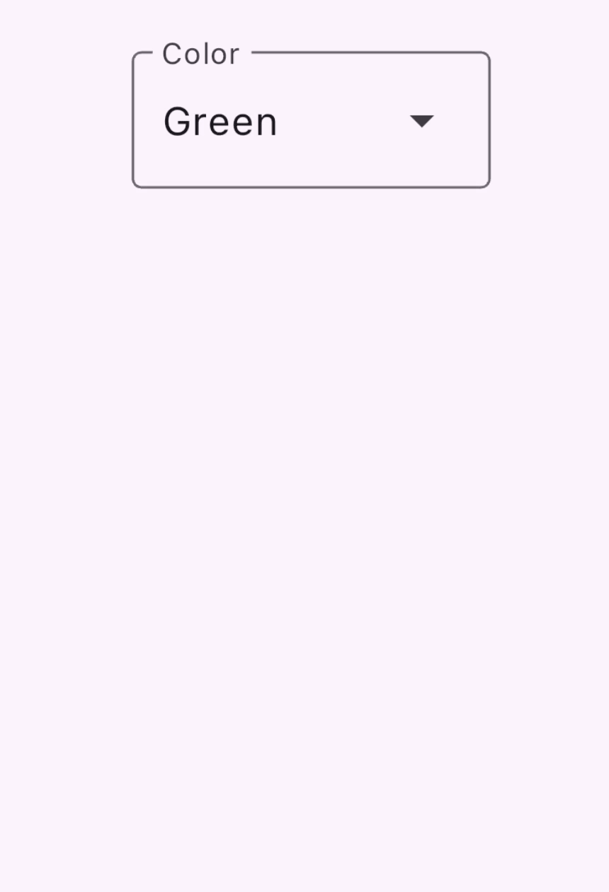
DropdownMenu
#DropdownMenu 允許使用者從選項選單中選擇一個選項,並將選定的文字放入 TextField 中。它還允許使用者根據文字輸入來篩選選單項目。
組態參數包括以下內容:
dropdownMenuEntries提供一個DropdownMenuEntry列表,描述每個選單項目。選單可能包含文字標籤,以及前導或後置圖示。(這也是唯一必需的參數。)TextEditingController允許以程式方式控制TextField。- 當使用者選擇一個選項時,會觸發
onSelected回呼函式。 initialSelection允許您設定預設值。- 還有其他參數可用於自訂小工具的外觀和行為。
enum ColorLabel {
  blue('Blue', Colors.blue),
  pink('Pink', Colors.pink),
  green('Green', Colors.green),
  yellow('Orange', Colors.orange),
  grey('Grey', Colors.grey);

  const ColorLabel(this.label, this.color);
  final String label;
  final Color color;
}

// StatefulWidget...
@override
Widget build(BuildContext context) {
  return DropdownMenu<ColorLabel>(
    initialSelection: ColorLabel.green,
    controller: colorController,
    // requestFocusOnTap is enabled/disabled by platforms when it is null.
    // On mobile platforms, this is false by default. Setting this to true will
    // trigger focus request on the text field and virtual keyboard will appear
    // afterward. On desktop platforms however, this defaults to true.
    requestFocusOnTap: true,
    label: const Text('Color'),
    onSelected: (ColorLabel? color) {
      setState(() {
        selectedColor = color;
      });
    },
    dropdownMenuEntries: ColorLabel.values
      .map<DropdownMenuEntry<ColorLabel>>(
          (ColorLabel color) {
            return DropdownMenuEntry<ColorLabel>(
              value: color,
              label: color.label,
              enabled: color.label != 'Grey',
              style: MenuItemButton.styleFrom(
                foregroundColor: color.color,
              ),
            );
      }).toList(),
  );
}
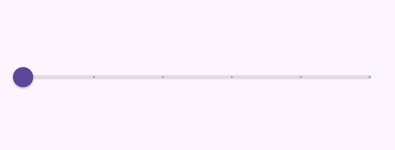
Slider
#Slider 小工具讓使用者可以透過移動指示器來調整數值,例如音量條。
Slider 小工具的組態參數:
value代表滑桿的目前值onChanged是當控制柄移動時觸發的回呼函式min和max建立滑桿允許的最小值和最大值divisions建立一個離散間隔,使用者可以透過該間隔沿著軌道移動控制柄。
double _currentVolume = 1;

@override
Widget build(BuildContext context) {
  return Slider(
    value: _currentVolume,
    max: 5,
    divisions: 5,
    label: _currentVolume.toString(),
    onChanged: (double value) {
      setState(() {
        _currentVolume = value;
      });
    },
  );
}
影片:Slider, RangeSlider, CupertinoSlider (Widget of the Week)
API 文件: SegmentedButton • DropdownMenu • Slider • Chip
在值之間切換
#您的 UI 可以透過幾種方式讓使用者在數值之間切換。
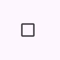
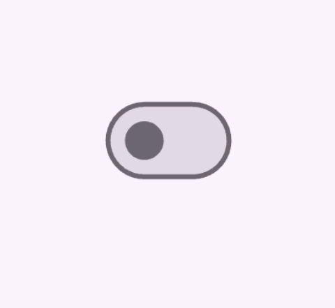
Checkbox、Switch 和 Radio
#提供一個選項來開啟和關閉單個數值。這些小工具背後的運作邏輯是相同的,因為這 3 個小工具都是建立在 ToggleableStateMixin 之上,儘管每個小工具都提供稍微不同的呈現方式。
Checkbox是一個容器,當值為 false 時為空,當值為 true 時則會填入一個核取記號。Switch有一個控制柄,當值為 false 時位於左側,當值為 true 時滑到右側。Radio類似於Checkbox,因為它是一個容器,當值為 false 時為空,但當值為 true 時則會填入。
Checkbox 和 Switch 的組態包含:
- 一個
value,其值為true或false - 以及一個
onChanged回呼函式,當使用者切換小工具時會觸發該函式
Checkbox
#bool isChecked = false;
@override
Widget build(BuildContext context) {
return Checkbox(
checkColor: Colors.white,
value: isChecked,
onChanged: (bool? value) {
setState(() {
isChecked = value!;
});
},
);
}
Switch
#bool light = true;
@override
Widget build(BuildContext context) {
return Switch(
// This bool value toggles the switch.
value: light,
activeColor: Colors.red,
onChanged: (bool value) {
// This is called when the user toggles the switch.
setState(() {
light = value;
});
},
);
}
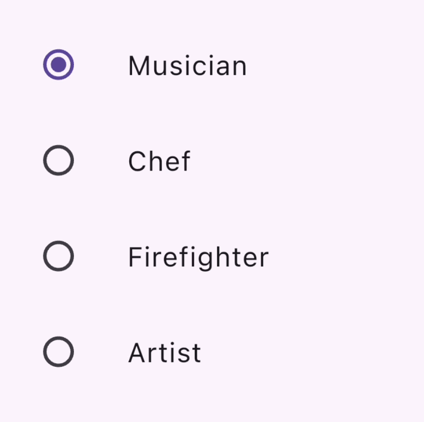
Radio
#一組 Radio 按鈕,允許使用者在互斥的數值之間進行選擇。當使用者選擇群組中的一個單選按鈕時,其他單選按鈕會被取消選擇。
- 特定
Radio按鈕的value代表該按鈕的值, - 一組單選按鈕的選定值由
groupValue參數識別。 Radio也有一個onChanged回呼函式,當使用者點擊它時會觸發該函式,就像Switch和Checkbox一樣
enum Character { musician, chef, firefighter, artist }

class RadioExample extends StatefulWidget {
  const RadioExample({super.key});

  @override
  State<RadioExample> createState() => _RadioExampleState();
}

class _RadioExampleState extends State<RadioExample> {
  Character? _character = Character.musician;

  void setCharacter(Character? value) {
    setState(() {
      _character = value;
    });
  }

  @override
  Widget build(BuildContext context) {
    return Column(
      children: <Widget>[
        ListTile(
          title: const Text('Musician'),
          leading: Radio<Character>(
            value: Character.musician,
            groupValue: _character,
            onChanged: setCharacter,
          ),
        ),
        ListTile(
          title: const Text('Chef'),
          leading: Radio<Character>(
            value: Character.chef,
            groupValue: _character,
            onChanged: setCharacter,
          ),
        ),
        ListTile(
          title: const Text('Firefighter'),
          leading: Radio<Character>(
            value: Character.firefighter,
            groupValue: _character,
            onChanged: setCharacter,
          ),
        ),
        ListTile(
          title: const Text('Artist'),
          leading: Radio<Character>(
            value: Character.artist,
            groupValue: _character,
            onChanged: setCharacter,
          ),
        ),
      ],
    );
  }
}
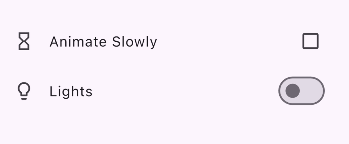
額外功能:CheckboxListTile & SwitchListTile
#這些便利小工具與核取方塊和小工具相同,但支援標籤(作為 ListTile)。
double timeDilation = 1.0;
bool _lights = false;

@override
Widget build(BuildContext context) {
  return Column(
    children: [
      CheckboxListTile(
        title: const Text('Animate Slowly'),
        value: timeDilation != 1.0,
        onChanged: (bool? value) {
          setState(() {
            timeDilation = value! ? 10.0 : 1.0;
          });
        },
        secondary: const Icon(Icons.hourglass_empty),
      ),
      SwitchListTile(
        title: const Text('Lights'),
        value: _lights,
        onChanged: (bool value) {
          setState(() {
            _lights = value;
          });
        },
        secondary: const Icon(Icons.lightbulb_outline),
      ),
    ],
  );
}
API 文件:Checkbox • CheckboxListTile • Switch • SwitchListTile • Radio
選擇日期或時間
#提供小工具,讓使用者可以選擇日期和時間。
有一組對話框可讓使用者選擇日期或時間,如您在以下章節中所見。除了日期類型不同(日期的 DateTime 與時間的 TimeOfDay)之外,這些對話框的功能類似,您可以透過提供以下內容來設定它們:
- 預設的
initialDate或initialTime - 或者,一個決定顯示選擇器 UI 的
initialEntryMode。
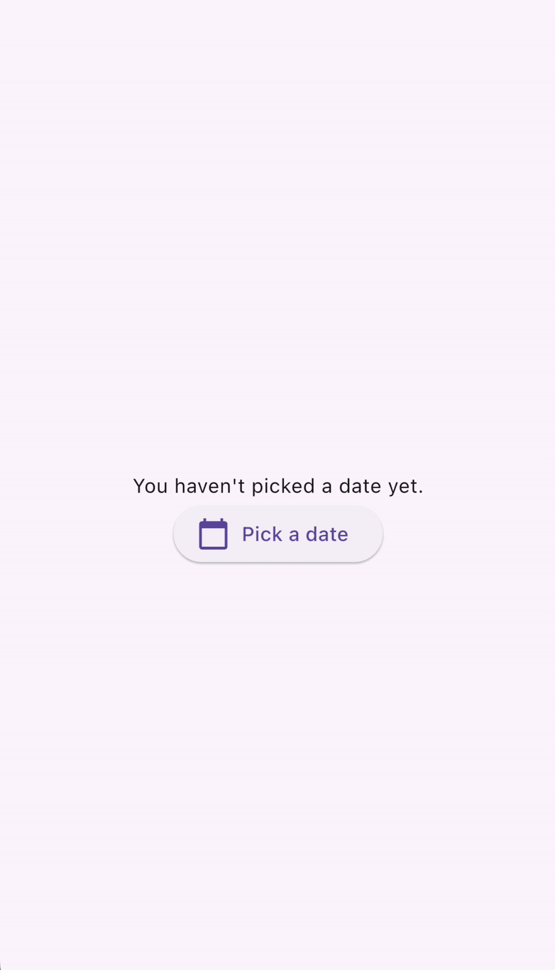
DatePickerDialog
#此對話框允許使用者選擇日期或日期範圍。透過呼叫 showDatePicker 函式來啟用,該函式會傳回 Future<DateTime>,因此別忘了等待非同步函式呼叫!
DateTime? selectedDate;

@override
Widget build(BuildContext context) {
  var date = selectedDate;

  return Column(children: [
    Text(
      date == null
          ? "You haven't picked a date yet."
          : DateFormat('MM-dd-yyyy').format(date),
    ),
    ElevatedButton.icon(
      icon: const Icon(Icons.calendar_today),
      onPressed: () async {
        var pickedDate = await showDatePicker(
          context: context,
          initialEntryMode: DatePickerEntryMode.calendarOnly,
          initialDate: DateTime.now(),
          firstDate: DateTime(2019),
          lastDate: DateTime(2050),
        );

        setState(() {
          selectedDate = pickedDate;
        });
      },
      label: const Text('Pick a date'),
    )
  ]);
}
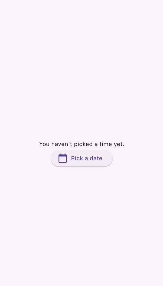
TimePickerDialog
#TimePickerDialog 是一個顯示時間選擇器的對話框。可以透過呼叫 showTimePicker() 函式來啟用。showTimePicker 不是傳回 Future<DateTime>,而是傳回 Future<TimeOfDay>。再一次,別忘了等待函式呼叫!
TimeOfDay? selectedTime;

@override
Widget build(BuildContext context) {
  var time = selectedTime;

  return Column(children: [
    Text(
      time == null ? "You haven't picked a time yet." : time.format(context),
    ),
    ElevatedButton.icon(
      icon: const Icon(Icons.calendar_today),
      onPressed: () async {
        var pickedTime = await showTimePicker(
          context: context,
          initialEntryMode: TimePickerEntryMode.dial,
          initialTime: TimeOfDay.now(),
        );

        setState(() {
          selectedTime = pickedTime;
        });
      },
      label: const Text('Pick a date'),
    )
  ]);
}
API 文件: showDatePicker • showTimePicker
滑動 & 拖曳
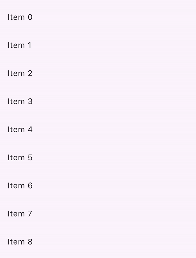
#Dismissible 是一個小工具,可讓使用者透過滑動來關閉它。它具有許多組態參數,包括
- 一個
child小工具 - 一個
onDismissed回呼函式,在使用者滑動時觸發 - 樣式設定參數,例如
background - 包含一個
key物件也很重要,這樣才能在小工具樹狀結構中從同級的Dismissible小工具中唯一識別它們。
List<int> items = List<int>.generate(100, (int index) => index);

@override
Widget build(BuildContext context) {
  return ListView.builder(
    itemCount: items.length,
    padding: const EdgeInsets.symmetric(vertical: 16),
    itemBuilder: (BuildContext context, int index) {
      return Dismissible(
        background: Container(
          color: Colors.green,
        ),
        key: ValueKey<int>(items[index]),
        onDismissed: (DismissDirection direction) {
          setState(() {
            items.removeAt(index);
          });
        },
        child: ListTile(
          title: Text(
            'Item ${items[index]}',
          ),
        ),
      );
    },
  );
}
檢查點:完成此教學課程,瞭解如何使用可關閉的小工具實作滑動以關閉。
API 文件: Dismissible
正在尋找更多小工具嗎?
#此頁面僅介紹您可以在 Flutter 應用程式中用於處理使用者輸入的一些常見 Material 小工具。請查看Material 小工具程式庫和Material 程式庫 API 文件以取得完整的小工具列表。
示範:請參閱 Flutter 的Material 3 示範,其中包含 Material 程式庫中提供的使用者輸入小工具的精選範例。
如果 Material 和 Cupertino 程式庫沒有符合您需求的小工具,請查看 pub.dev 以尋找 Flutter 和 Dart 社群擁有和維護的套件。例如,flutter_slidable 套件提供了一個 Slidable 小工具,它比上一節中描述的 Dismissible 小工具更具可自訂性。
使用 GestureDetector 建構互動式小工具
#您是否已仔細研究過小工具程式庫、pub.dev、詢問過您的程式設計朋友,但仍然找不到符合您尋找的使用者互動的小工具?您可以使用 GestureDetector 建立自己的自訂小工具並使其具有互動性。
檢查點:使用此食譜作為起點,建立您自己的自訂按鈕小工具,它可以處理點擊。
參考資料:請查看點擊、拖曳和其他手勢,其中說明如何在 Flutter 中接聽並回應手勢。
額外影片:是否好奇 Flutter 的
GestureArena如何將原始使用者互動資料轉換為人類可識別的概念,例如點擊、拖曳和捏合?請觀看此影片:GestureArena (Decoding Flutter)
別忘了無障礙功能!
#如果您正在建立自訂小工具,請使用 Semantics 小工具註解其含義。它會為螢幕閱讀器和其他基於語意分析的工具提供描述和中繼資料。
API 文件:GestureDetector • Semantics
測試
#當您完成在應用程式中建立使用者互動後,別忘了編寫測試以確保一切正常運作!
這些教學課程會引導您編寫測試,以模擬應用程式中的使用者互動
檢查點:依照此點擊、拖曳和輸入文字食譜文章,學習如何使用
WidgetTester來模擬和測試應用程式中的使用者互動。
額外教學:處理捲動的 cookbook 食譜示範了如何透過使用 widget 測試捲動列表來驗證 widget 列表是否包含預期的內容。
下一步:網路
#這個頁面是關於處理使用者輸入的介紹。現在您已經了解如何處理來自應用程式使用者的輸入,您可以透過新增外部資料來讓您的應用程式更加有趣。在下一節中,您將學習如何透過網路為您的應用程式獲取資料、如何將資料轉換為 JSON 以及從 JSON 轉換資料、驗證和其他網路功能。
意見回饋
#由於網站的這部分正在不斷發展,我們歡迎您的回饋!
除非另有說明,否則本網站上的文件皆反映 Flutter 的最新穩定版本。頁面最後更新於 2024-09-26。 檢視原始碼 或 回報問題。