處理點擊
您不僅希望向使用者顯示資訊,還希望使用者與您的應用程式互動。使用 GestureDetector 小工具來回應基本的動作,例如點擊和拖曳。
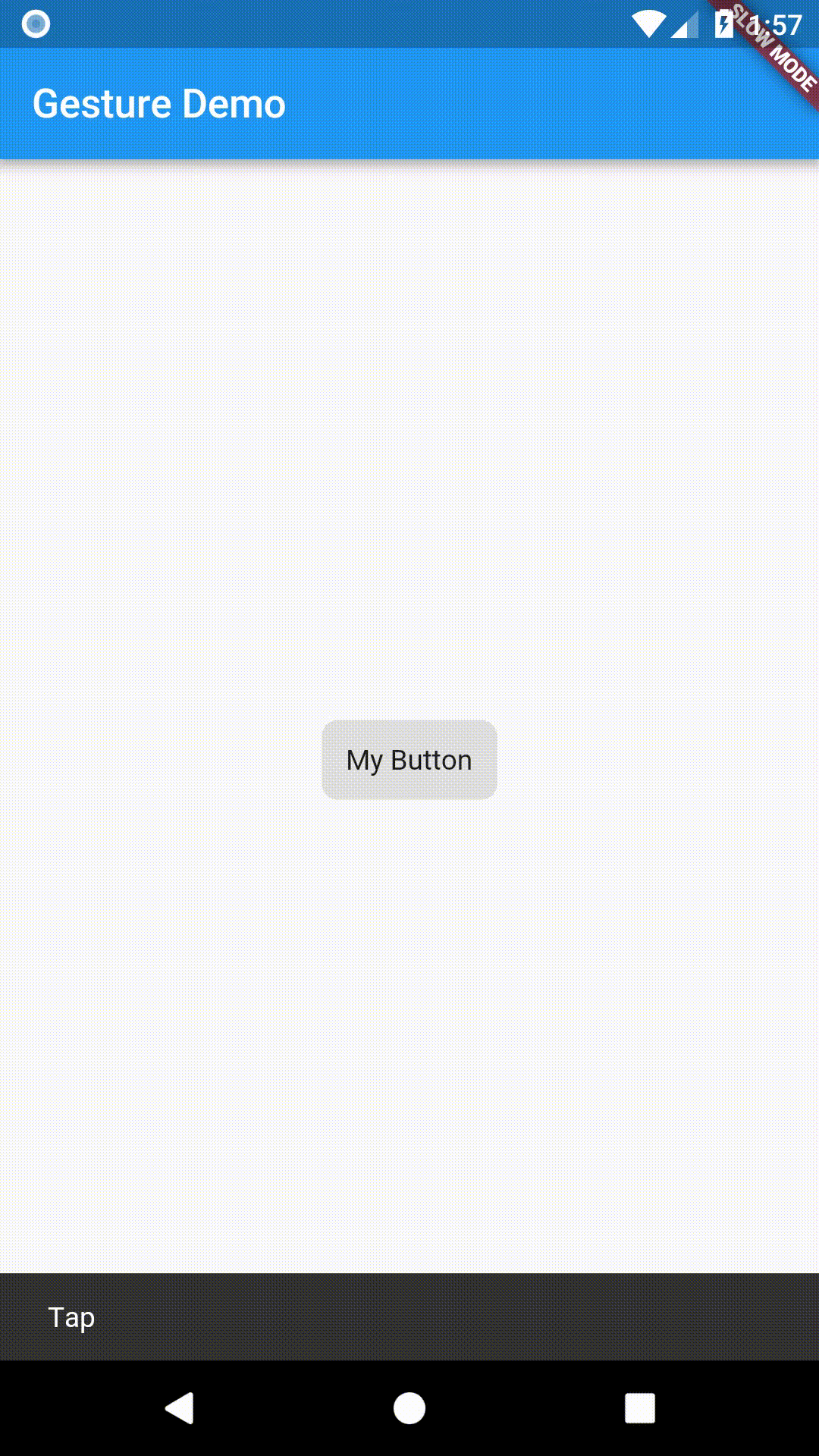
此食譜顯示如何建立一個自訂按鈕,在點擊時顯示一個訊息列,步驟如下
- 建立按鈕。
- 將其包裝在帶有
onTap()回呼的GestureDetector中。
dart
// The GestureDetector wraps the button.
GestureDetector(
  // When the child is tapped, show a snackbar.
  onTap: () {
    const snackBar = SnackBar(content: Text('Tap'));

    ScaffoldMessenger.of(context).showSnackBar(snackBar);
  },
  // The custom button
  child: Container(
    padding: const EdgeInsets.all(12),
    decoration: BoxDecoration(
      color: Colors.lightBlue,
      borderRadius: BorderRadius.circular(8),
    ),
    child: const Text('My Button'),
  ),
)
筆記
#- 有關將 Material 水波紋效果新增至按鈕的資訊,請參閱新增 Material 觸控水波紋食譜。
- 雖然此範例建立了一個自訂按鈕,但 Flutter 包含一些按鈕實作,例如:
ElevatedButton、TextButton和CupertinoButton。
互動範例
#import 'package:flutter/material.dart';
void main() => runApp(const MyApp());
class MyApp extends StatelessWidget {
const MyApp({super.key});
@override
Widget build(BuildContext context) {
const title = 'Gesture Demo';
return const MaterialApp(
title: title,
home: MyHomePage(title: title),
);
}
}
class MyHomePage extends StatelessWidget {
final String title;
const MyHomePage({super.key, required this.title});
@override
Widget build(BuildContext context) {
return Scaffold(
appBar: AppBar(
title: Text(title),
),
body: const Center(
child: MyButton(),
),
);
}
}
class MyButton extends StatelessWidget {
const MyButton({super.key});
@override
Widget build(BuildContext context) {
// The GestureDetector wraps the button.
return GestureDetector(
// When the child is tapped, show a snackbar.
onTap: () {
const snackBar = SnackBar(content: Text('Tap'));
ScaffoldMessenger.of(context).showSnackBar(snackBar);
},
// The custom button
child: Container(
padding: const EdgeInsets.all(12),
decoration: BoxDecoration(
color: Colors.lightBlue,
borderRadius: BorderRadius.circular(8),
),
child: const Text('My Button'),
),
);
}
}
除非另有說明,否則本網站上的文件反映了 Flutter 的最新穩定版本。頁面最後更新於 2024-07-06。 檢視原始碼 或 回報問題。